
Documentation Index

Fetch the complete documentation index at: https://docs.symplr.io/llms.txt

Use this file to discover all available pages before exploring further.

Blueprint View provides a visual representation of the application structure, screen relationships, navigation flows, and connected application logic generated within Symplr. After creating an application using a Figma design, AI prompt, or template, Symplr automatically generates a blueprint that visually maps the application flow from the starting screen through connected screens, actions, and navigation paths. Blueprint View acts as the central workspace for reviewing, extending, organizing, and managing the generated application structure.

Before You Begin

Before working in Blueprint View, ensure:
  • An application project has been created successfully
  • The application structure has been generated
  • You have access to the project workspace
  • Screens and navigation flows are available within the blueprint

Open Blueprint View

After generating or opening a project, Symplr loads the application directly in Blueprint View.
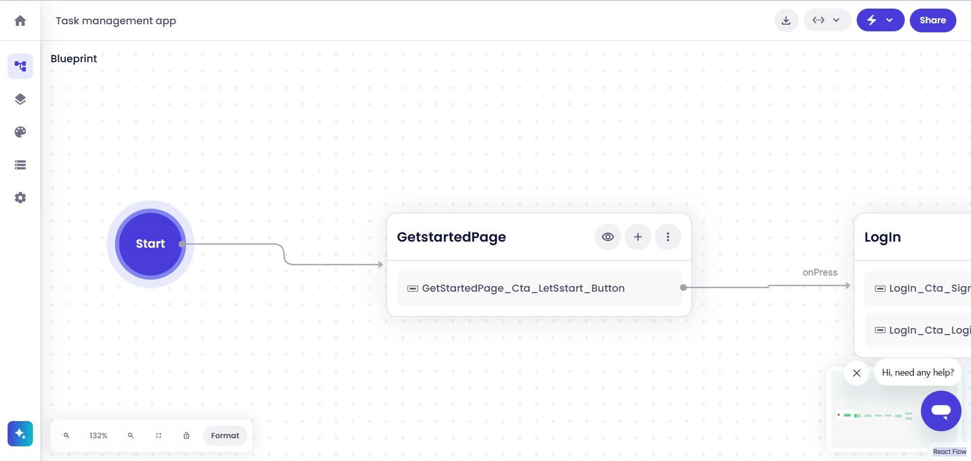
1 Full Blueprint View
The Blueprint workspace displays the application flow using connected screens and navigation paths.

Understand Screens and Navigation Flows

Each rectangle within the blueprint represents an individual application screen. Connections between screens represent navigation actions and user flow within the application. Navigation connectors may also display interaction names such as onPress, helping identify the action that triggers the navigation flow.
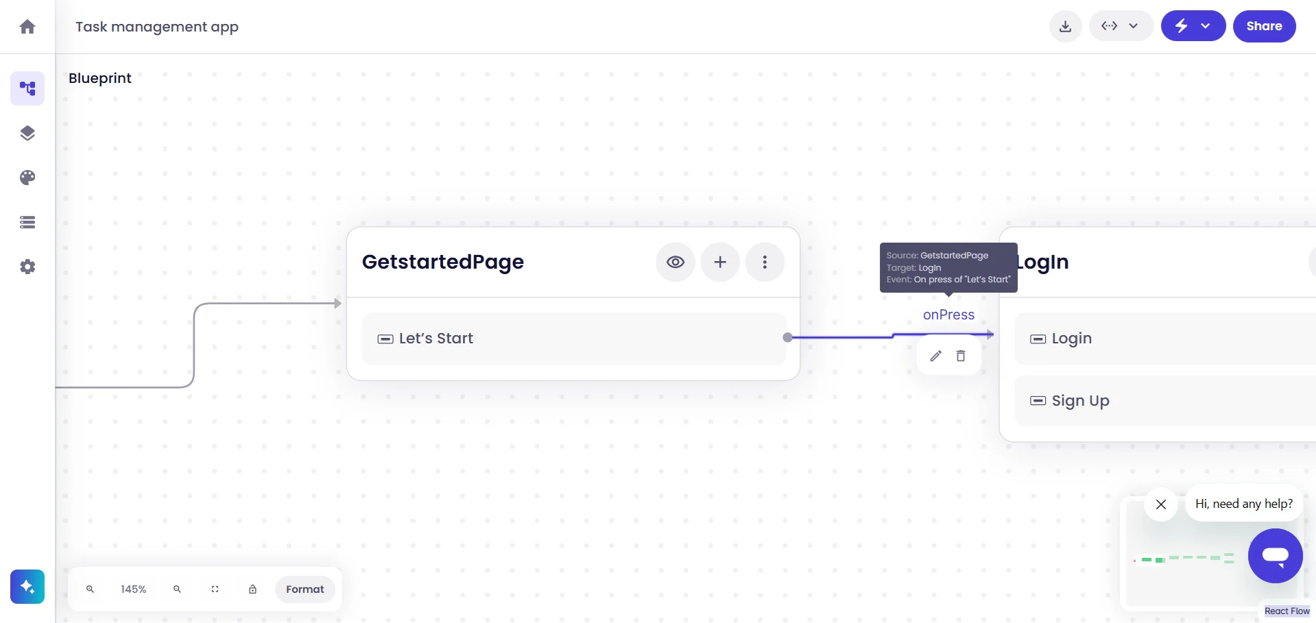
2 Screen Navigation Flow
Navigation paths display how users move between connected screens based on configured interactions. The blueprint structure helps visualize:
  • Application navigation flow
  • Connected screens
  • User interaction paths
  • Screen relationships
  • Application structure from start to end

Preview and Edit Screens

Each screen within Blueprint View can be previewed and edited individually. To open a screen preview, click the Preview icon available on the screen card.
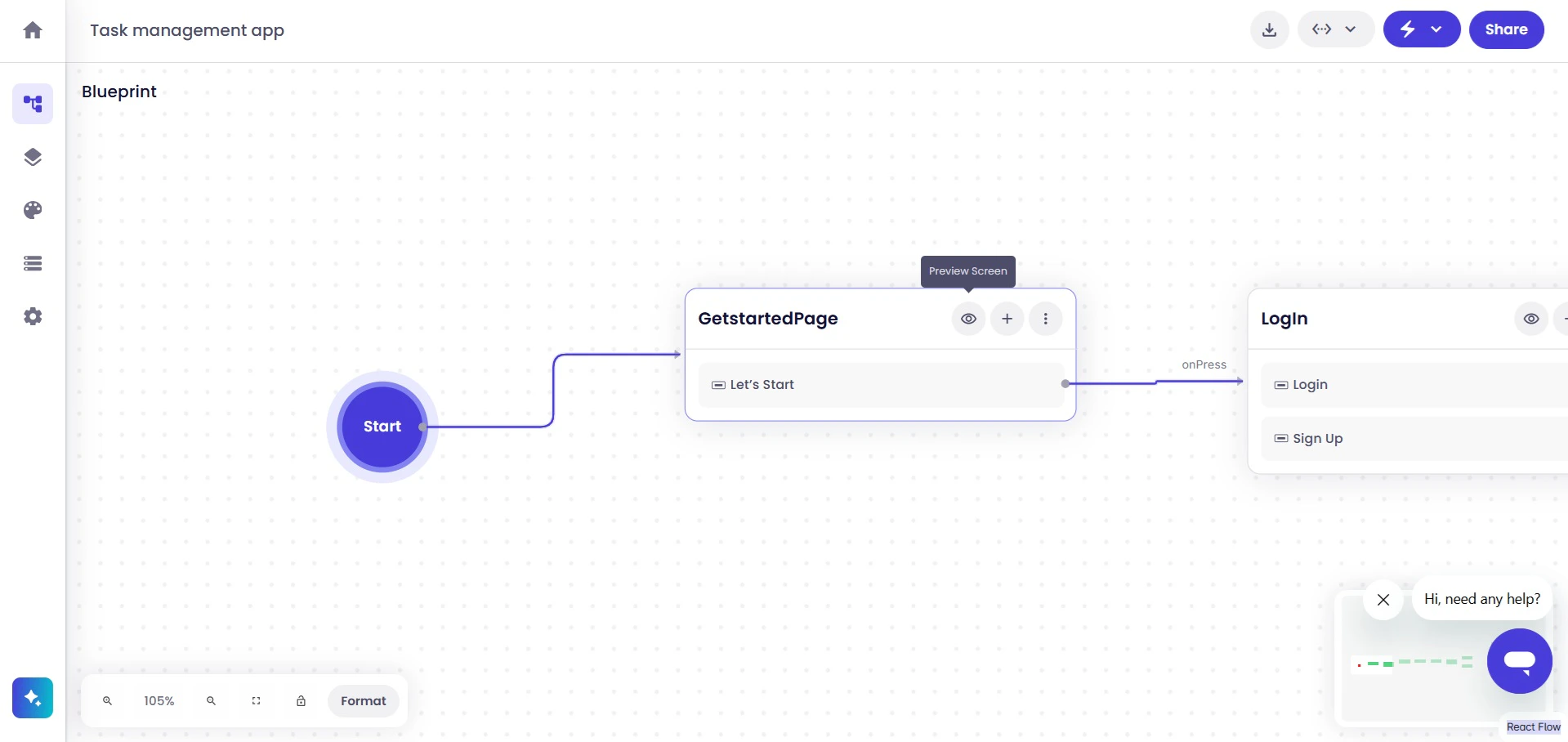
3 Preview Screen Option
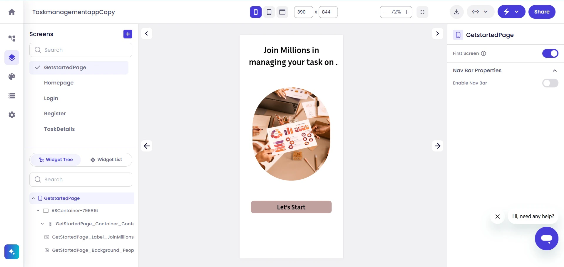
Symplr opens the selected screen within the screen editor workspace.
4 Previewing Screen
From the screen editor, you can continue configuring layouts, widgets, screen properties, navigation, and screen content.

Add Connections and Extend the Application

Blueprint View allows screens and application logic to be extended directly from existing screens. To add a new connection, click the Add (+) button available on the screen card.
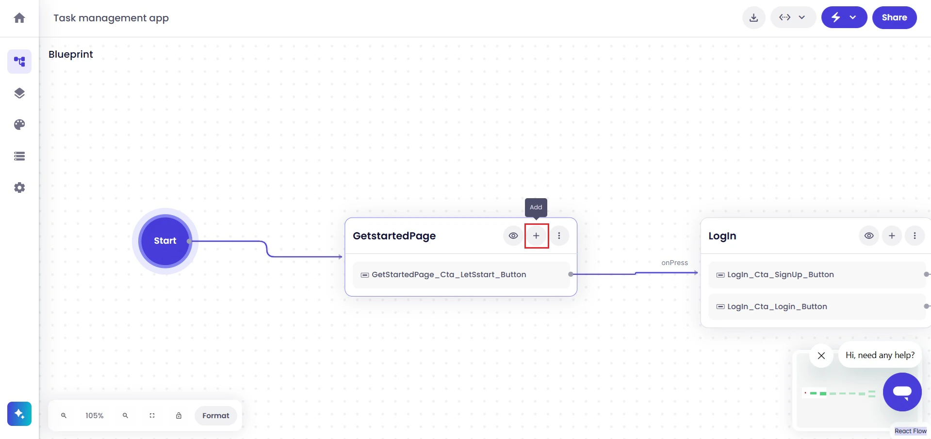
5 Add Option
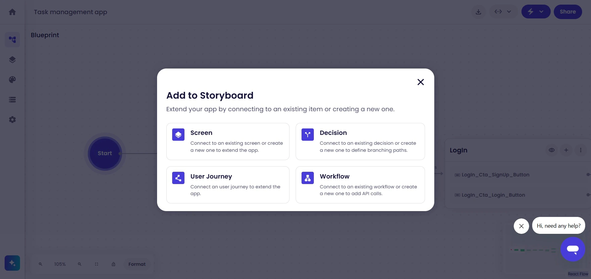
Symplr displays the Add to Storyboard dialog.
6 Add To Story Board Popup
The storyboard options allow additional application elements to be connected directly to the selected screen. Available connection types include:
  • Screen
  • Decision
  • User Journey
  • Workflow

Add Screens

Use the Screen option to connect existing screens or create new application screens.
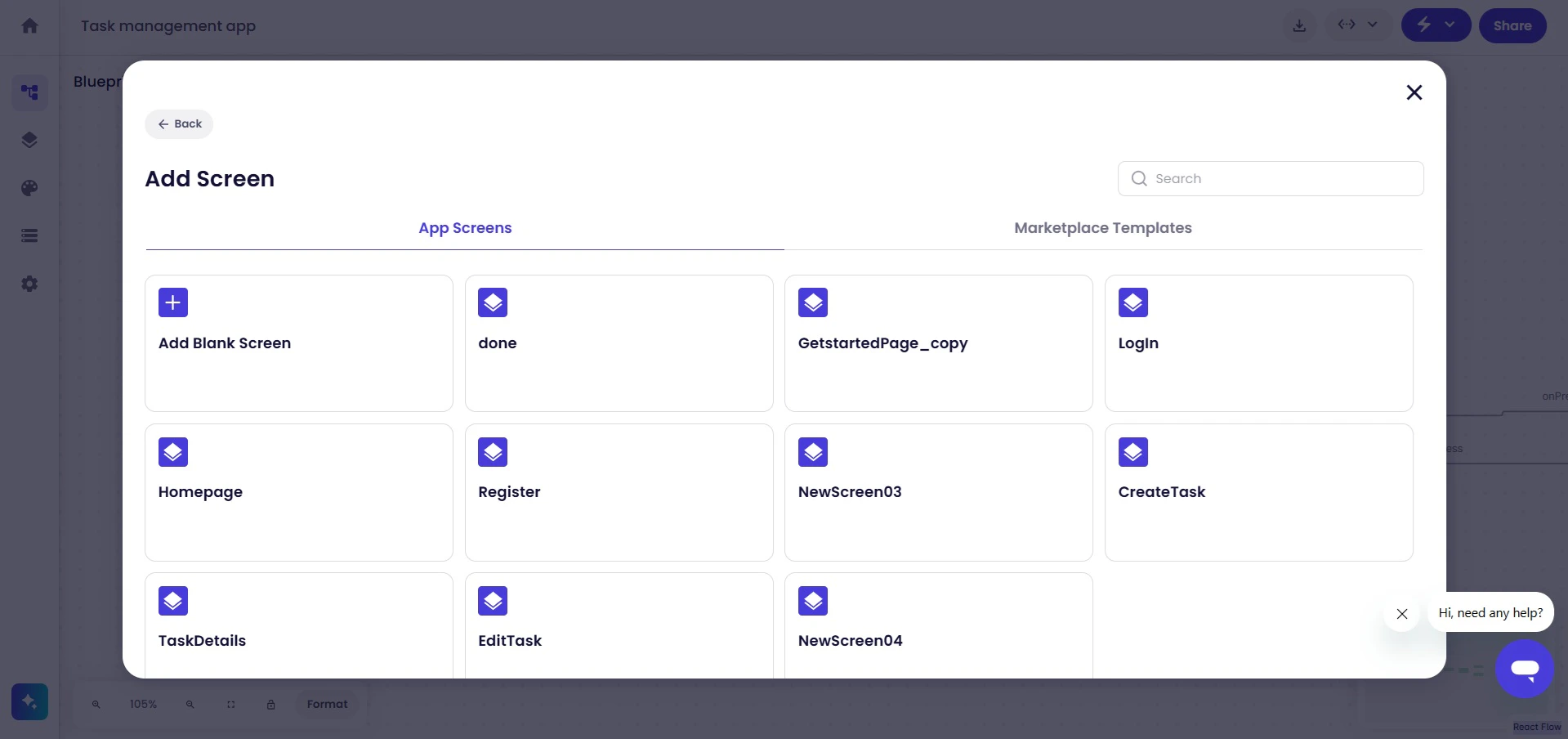
7 Add Screen Option
Additional screens extend the navigation structure and application flow.

Add Decisions

Use the Decision option to create branching logic and conditional navigation paths within the application flow.
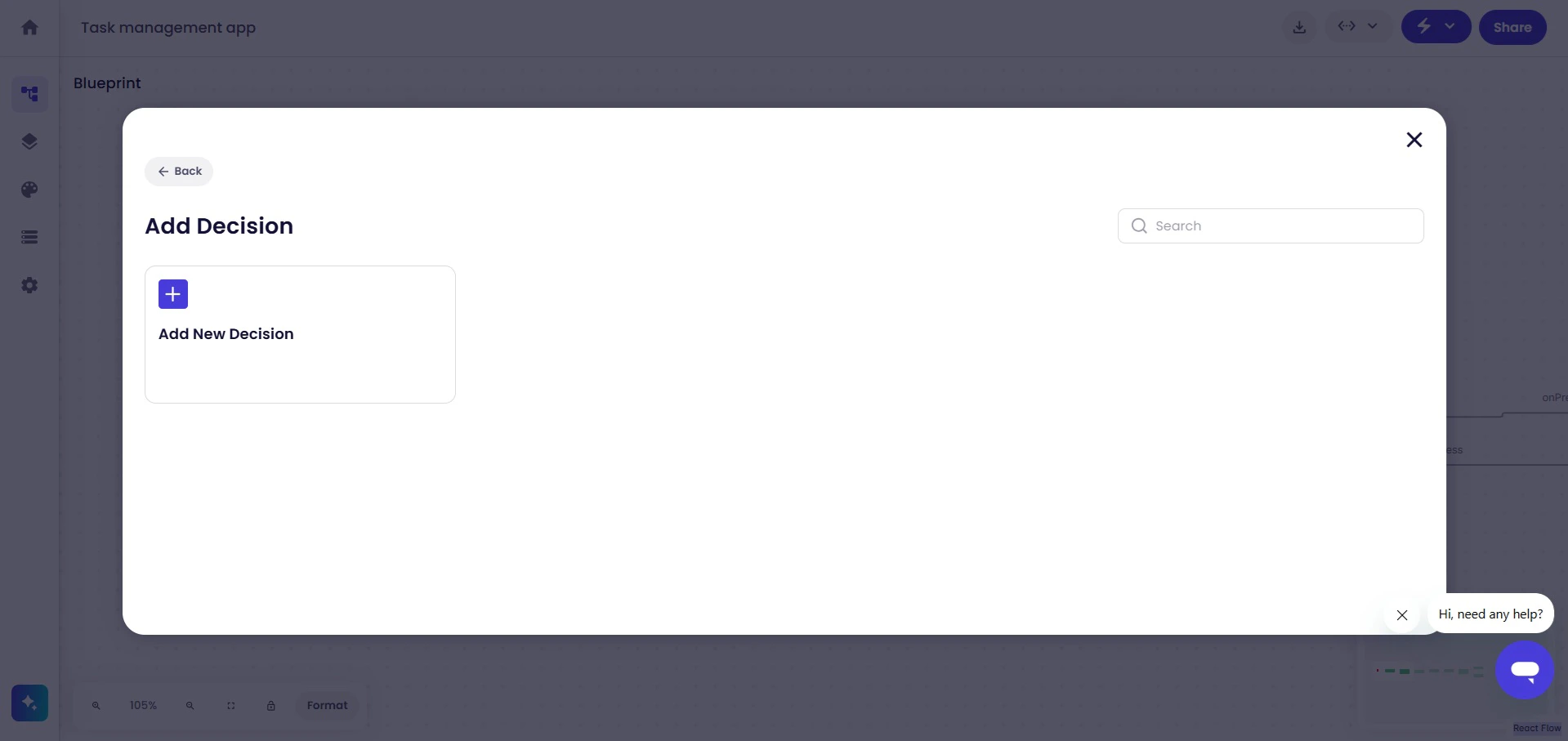
8 Add Decision Option
Decisions help define multiple flow outcomes based on user actions, validations, or application conditions.

Add User Journeys

Use the User Journey option to connect reusable user flows and interaction sequences to the application.
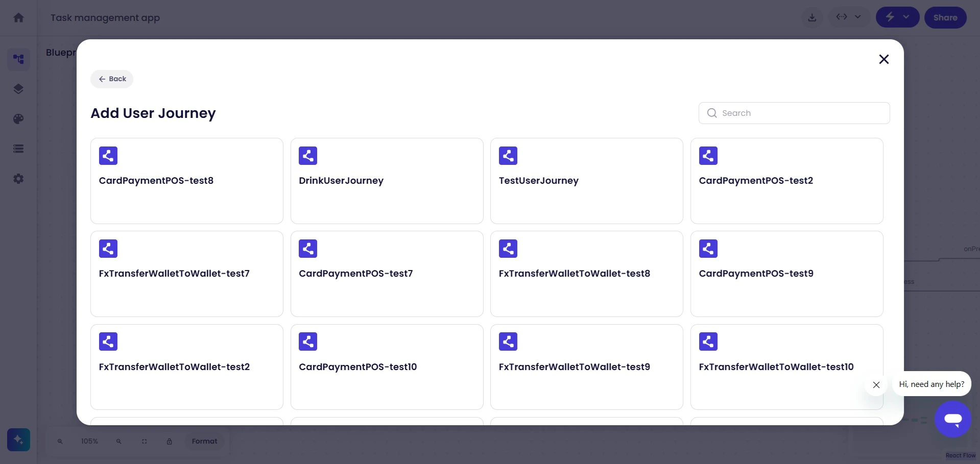
9 Add User Journey
User Journeys help organize larger application flows and reusable interaction patterns.

Add Workflows

Use the Workflow option to connect reusable workflows and backend-related processes to the application.
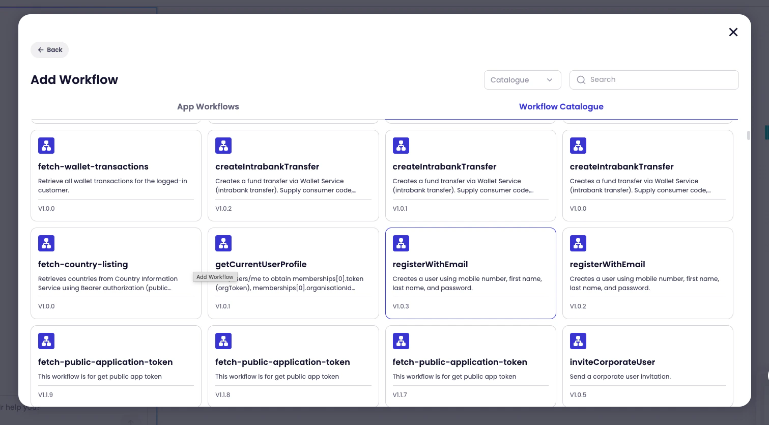
10 Add New Workflow
Workflows can be used to connect API operations, reusable business logic, external integrations, and backend processing steps. The workflow catalogue allows available workflows to be searched and connected directly to the application flow.

Manage Screens

Additional screen management options are available from the three-dot menu on each screen card.
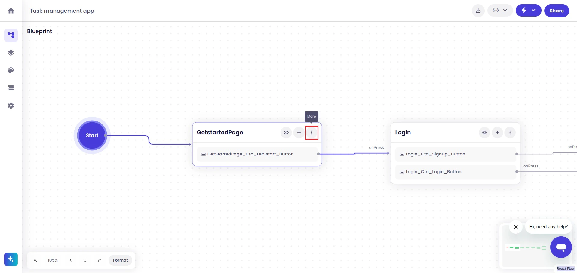
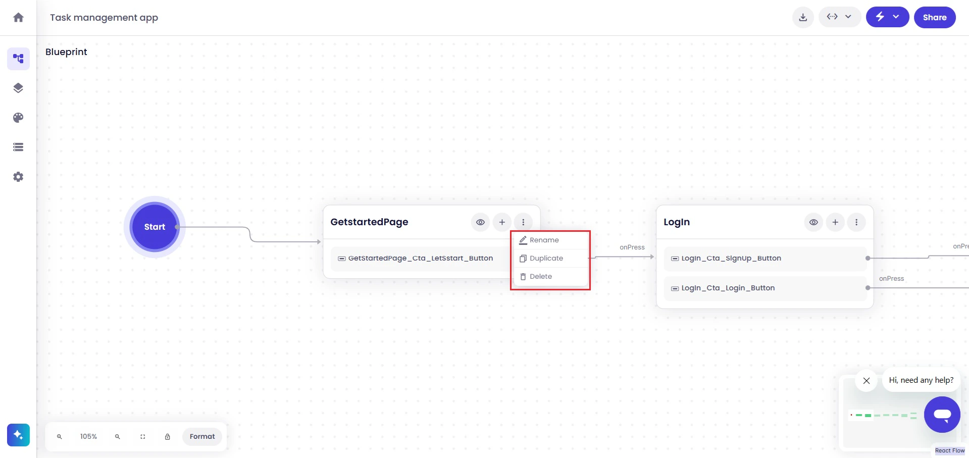
11 Three Dots
Clicking the menu displays available screen management actions.
12 Three Dot Menu
Available actions include:
  • Rename
  • Duplicate
  • Delete
These options help organize and maintain the application structure within Blueprint View.

Access Workspace Features

Blueprint View also provides access to additional workspace capabilities from the top-right corner of the workspace.
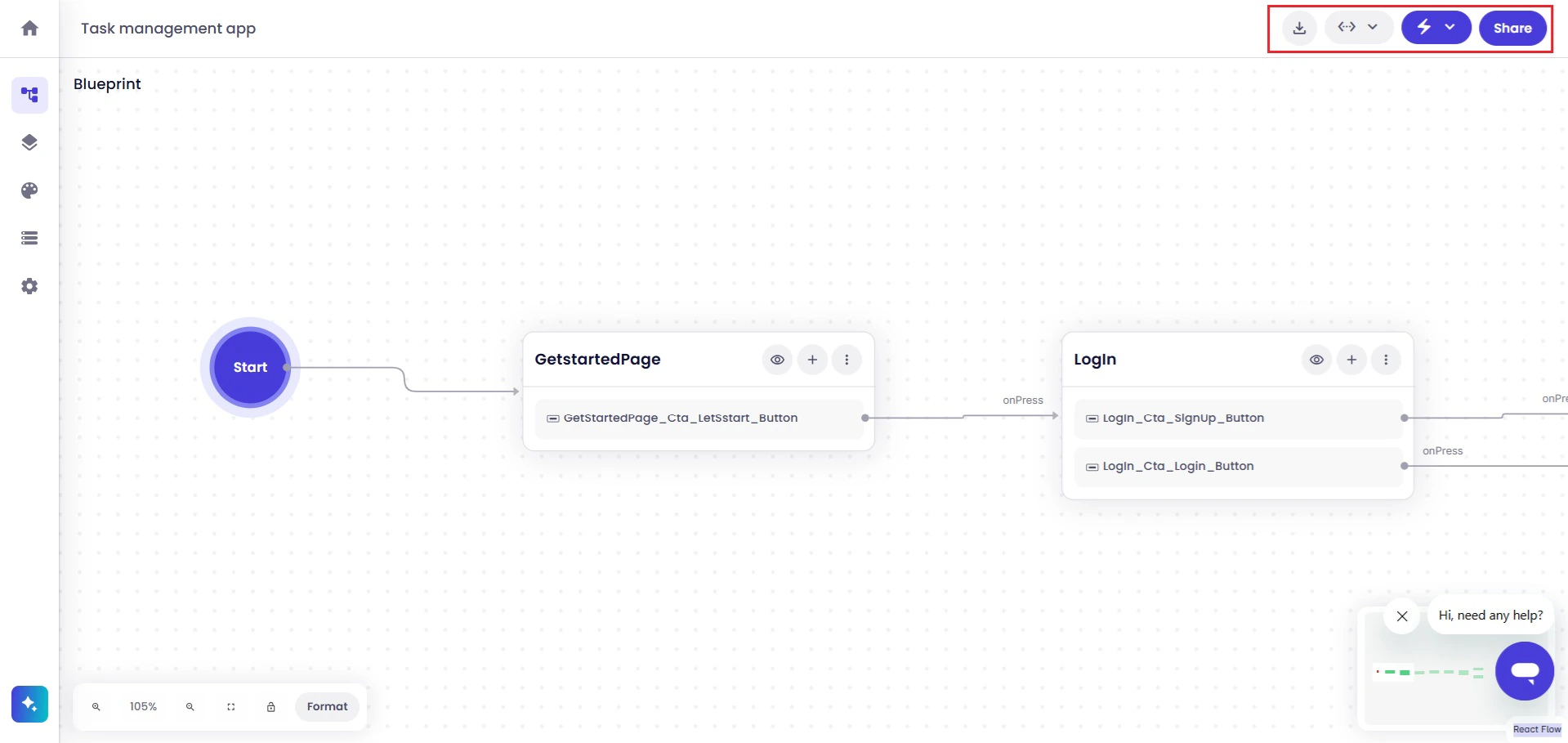
13 Top Right Workspace Actions
Available workspace actions include:
  • Download Application Definition
  • Developer Tools
  • Build & Run
  • Share Projects
These capabilities support application generation, testing, collaboration, configuration, and export workflows. Blueprint View includes workspace navigation and canvas controls to help manage large application structures.
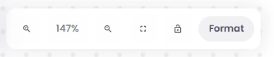
14 Workspace Controls
Available workspace controls include:
  • Zoom In
  • Zoom Out
  • Center Workspace
  • Lock or Unlock Canvas Movement
These controls help improve navigation and organization while working with larger application flows.

Next Steps

After reviewing and organizing the application structure in Blueprint View, continue by editing screens, configuring workflows, customizing themes, generating application previews, downloading code packages, configuring integrations, or sharing projects for collaboration.