
Before You Begin
Before configuring themes and customization settings, ensure:- Project is available in Blueprint View
- Application structure is configured
- You have access to Theme settings
Open Theme Settings
From the application workspace, open the Theme section from the left navigation panel.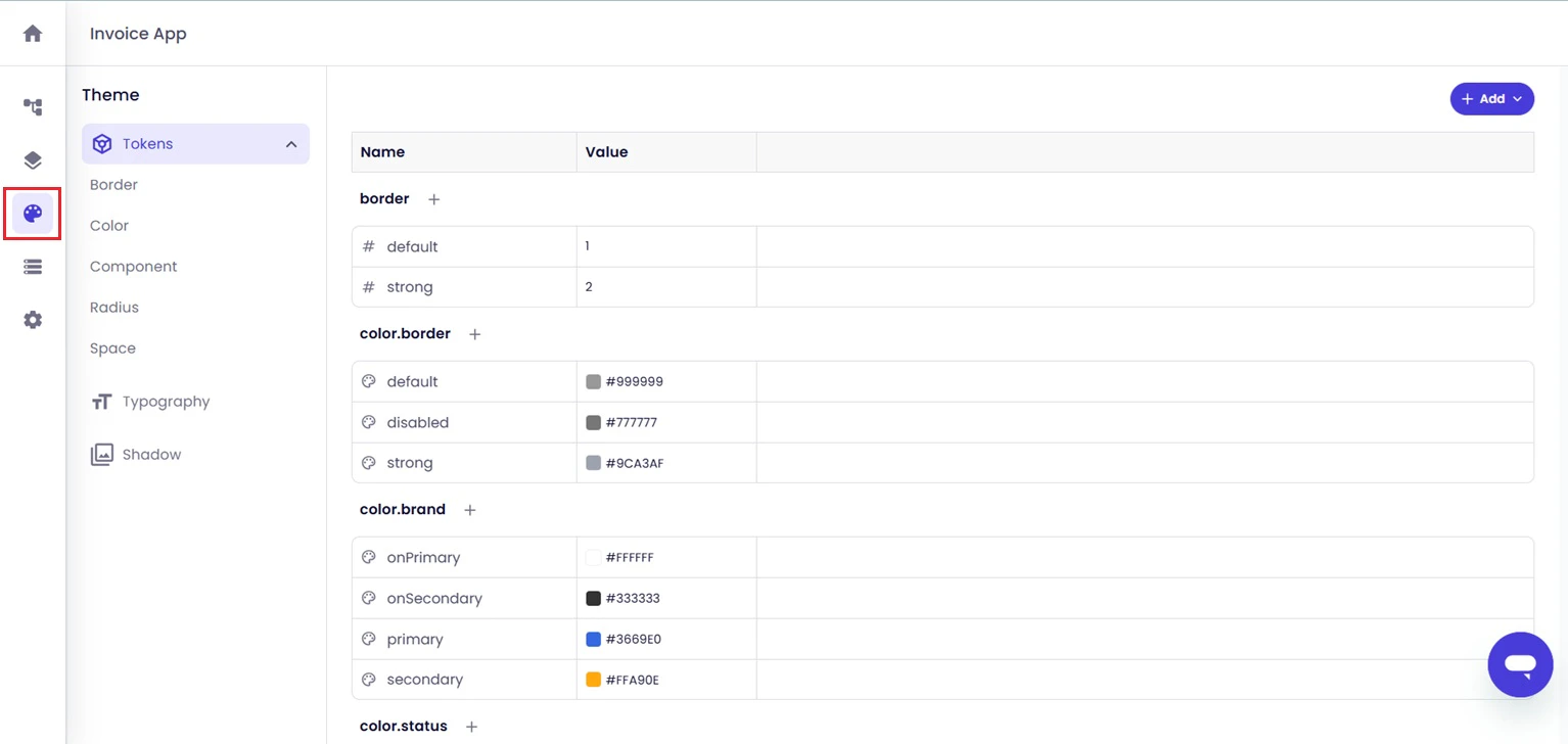
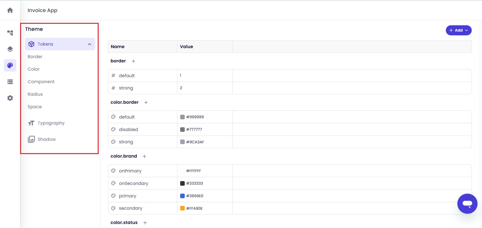
Configure Theme Tokens
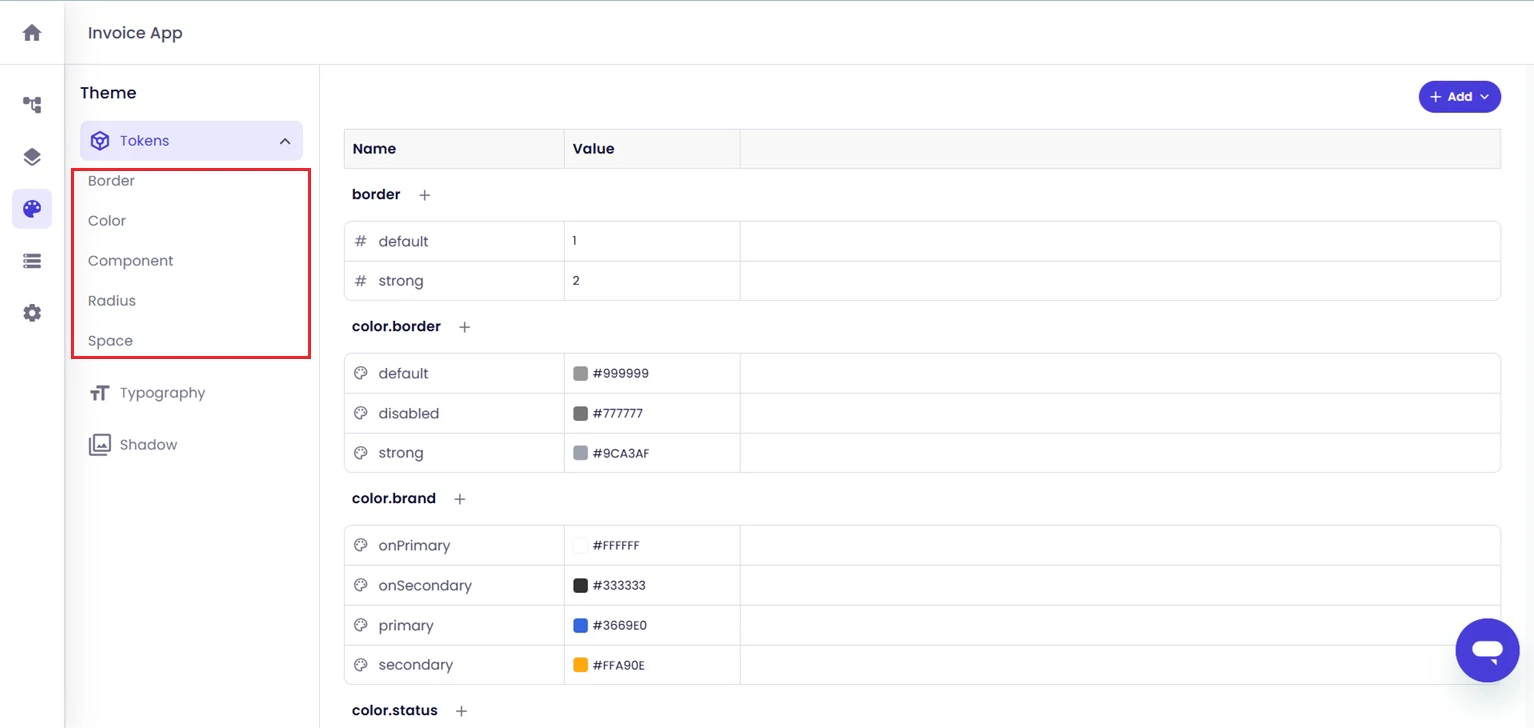
The Tokens section contains reusable visual properties used across the application. Available token categories include:- Border
- Color
- Component
- Radius
- Space
Edit Token Configurations
Existing token values can be updated directly within the Tokens view.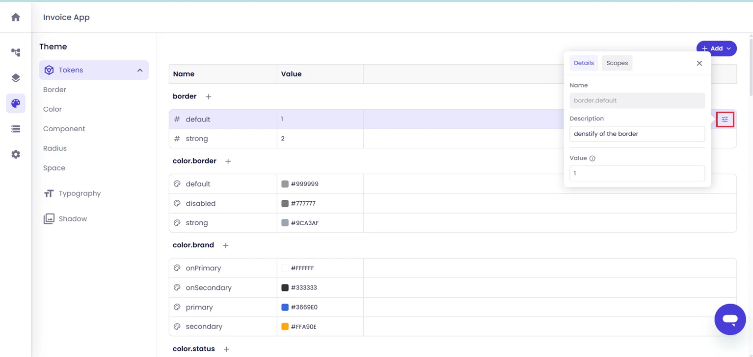
Add New Tokens
To create additional token configurations, use the Add option available within the Theme panel.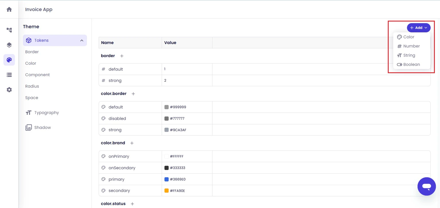
Configure Typography Settings
The Typography section displays reusable text styles and formatting settings used across the application.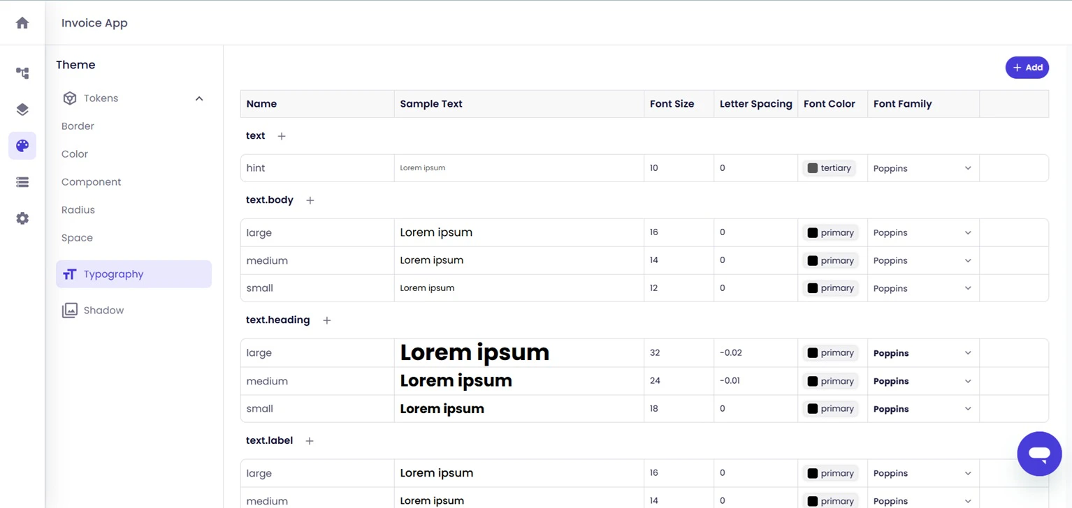
- Font size
- Letter spacing
- Font color
- Font family
- Text styles and variants
Configure Shadow Settings
The Shadow section displays reusable shadow settings for application components and layouts.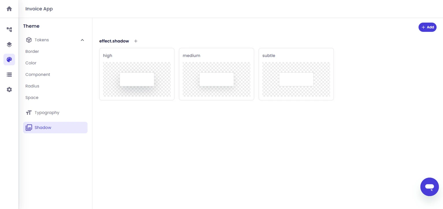
Add New Shadow Configurations
Use the configuration panel to define custom shadow styles and related visual properties.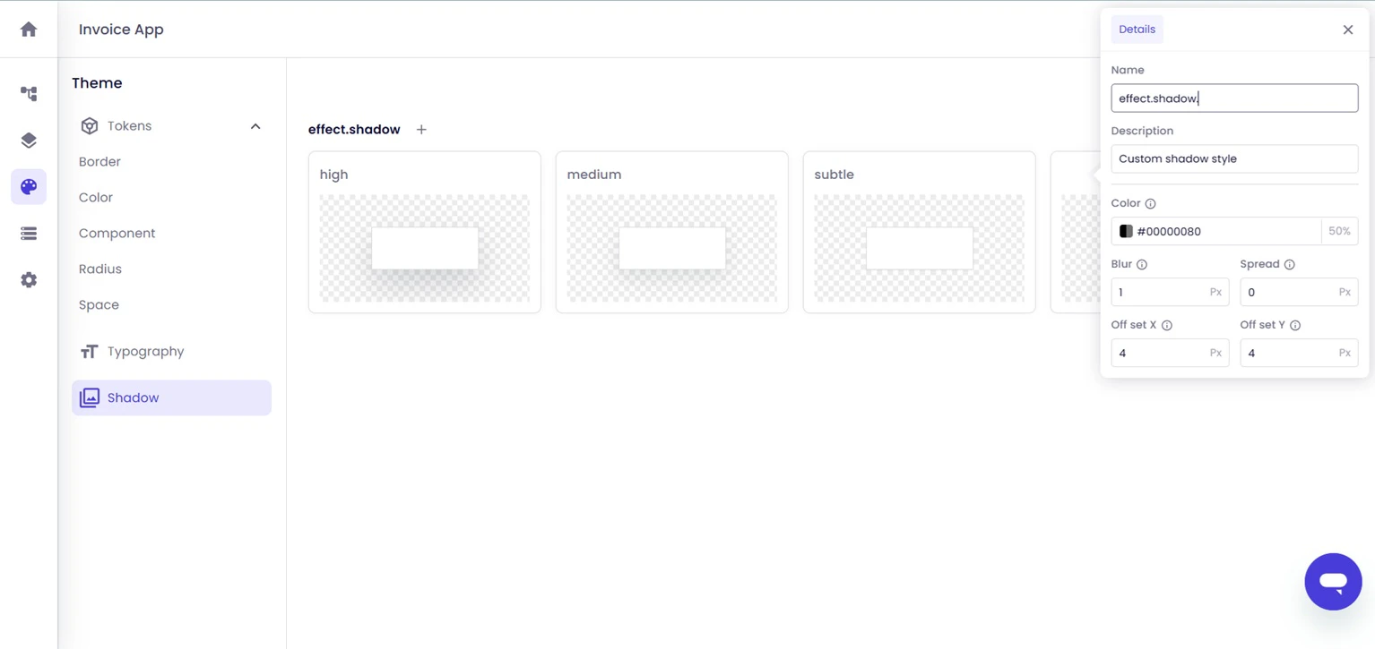
- Shadow color
- Blur
- Spread
- Horizontal offset
- Vertical offset